Wednesday, March 16, 2016 - 4:02:06 PM - By S. M. Nouman

The New Spider-man
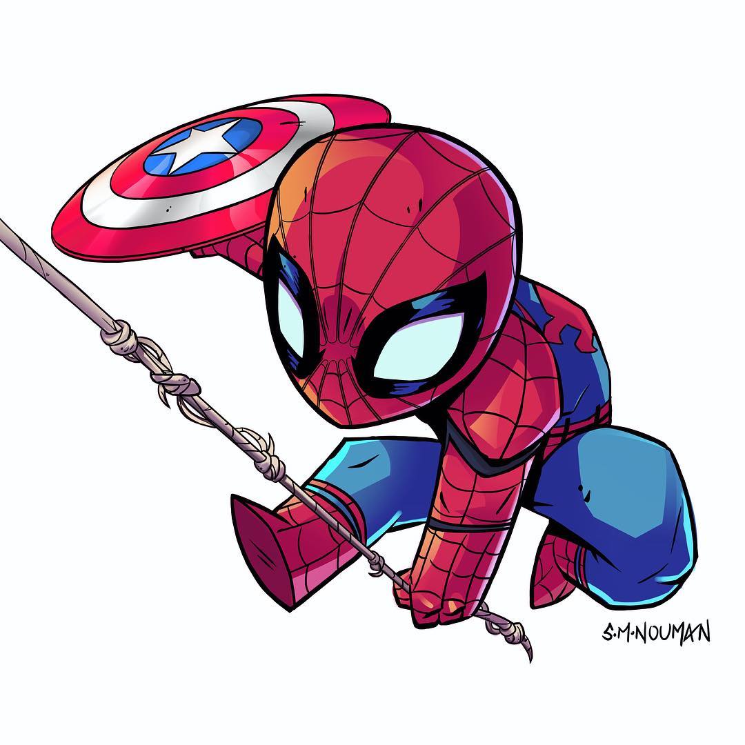
We’ve finally got a look at the newest iteration of Spider-Man. To some, the suit looked like a smooth, candy-coated CG mess, while others immediately recognized and appreciated the Silver Age-inspired design. What makes the new Marvel/Sony Spider-Man design so surprising compared to the other Spider-Man costumes is that it isn’t based on any recent design of the character from the comics and it exists in Stark contrast (rimshot!) to the gritty designs of Warner Bros. or Fox’s superhero universes.
The spider logo on the front is the smallest it has ever been, is a completely different design than the previous movie iterations — one that recalls the Silver Age costume of the character
The cool thing about the Civil War Spider-Man suit (besides the extra cartridges for his web-shooters) are the mechanical eyes. You can hear them whir as the black borders on the lenses contract, amazingly, from a John Romita-sized eye to a Steve Ditko-sized eye.
What the final Spider-Man design ended up being was a barely modernized version of a classic design, the next logical step for a company that introduced purple-skinned Paul Bettany with a yellow MacGuffin jewel embedded in his head.